|
1.
Introduction
Advances
in computer technology, such as memory size,
storage capacity and speed, together with development
in multimedia authoring software, have empowered
people involved in foreign / second language
teaching and learning, both teachers and learners.
They also engage language teachers and learners
with new challenges. More and more professionals
as well as amateurs are trying to find out how
to make effective use of this ever-developing
new form of medium- multimedia. At the same
time, CALL materials are experiencing a development
with unprecedented growth and experiments. More
and more CALL materials are designed to accommodate
users with special needs and interests.
This
paper describes the design of a language learning
and reinforcing package Pre-U. Experience, which
tries to make use of text, graphics, audio recordings
and videos - in a multimedia format. Before
going into details about the design features
of the package in terms of user interface, navigation,
tasks, video and text-based information, the
paper first defines the target users and the
pedagogic aims of it. Finally the essay makes
a few reflective points concerning multimedia
design for language teaching and learning in
general.
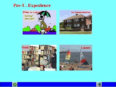
Figure
1: Menu page of Pre-U. Experience
2.
Target users 
This
section defines the target users of Pre-U. Experience.
It begins with an introduction of the initial
idea of a multimedia program for this special
group of people.
Pre-U.
Experience originated from my own experience
as a Chinese student studying in Brighton, U.
K., and also from the long-hour discussions
with other fellow students from China about
problems and difficulties concerning language
encountered by many Chinese students and scholars
who have newly arrived in the U. K. There are
some common characteristics among this group
of people. First of all, it is the first time
for most of them to be in an English-speaking
country. Although most of them have been learning
English since they were in the secondary school,
many still faced initial language problems like
listening comprehension, oral interaction with
local people, following lectures or instructions,
taking notes, asking questions in class, interacting
with supervisors, etc. (Cortazzi and Jin, 1996).
Puzzled by the way people speak in daily life
here, they were asking questions like "Why are
they talking so fast? and "How come can�t I follow
what they were talking about?" --- they felt
that the English language they had learned before
they came across the sea were very different
from what/how people actually speak to each
other over here. They found there was this urgent
need for them to pick up as soon as possible
the conversational skills in everyday life.
For example, Wang, one of the Electronics MSc
students said: "I don�t know how to respond when
people say to me �Morning. How are you?� Because
I want to tell them exactly how I feel, but
when I actually began to tell them how I lost
my glasses, they didn�t seem to be very interested
at all." Zhuang, a girl who�s studying Interior
Design, said: "It is always difficult for me
to start a conversation or ask for information.
I�m not sure how I shall ask these questions."
These are only a couple out of the many language
frustrations these Chinese students have experienced.
It is the awareness of these language problems
that motivates me to author this piece of multimedia
package Pre-U. Experience that can deal with
these particular language problems.
The
title Pre-U. Experience is selected after careful
consideration. It is used in two senses: Pre-United
Kingdom and Pre-university. By so titling, it
is my intention to appeal to those Chinese students
and scholars who plan to further their education
in the U. K. In China, it is true that one can
see some books like A Guide to Study in America
and A Guide to Study in the U. K. But
as far as I know, there has not been any multimedia
package which provides both opportunities for
language practice and background information
about studying and living in the U. K. Pre-U.
Experience is specially designed for this large
group of people who are planing and preparing
to come to the U. K. for a period of study.
It is for them to use before they leave China.
3.
Pedagogic aims
There
are two general aims for Pre-U. Experience.
One is to provide opportunities for users to
practise their daily conversational skill, especially
the fundamental interactional skill of asking
and answering questions. The other is to provide
background information about studying and living
in the U. K.
The
principal orientation of Pre-U. Experience is
to offer users an opportunity to experience
how English language functions in different
daily situations, particularly to sensitise
the users to the many different ways of asking
and answering questions under certain circumstances.
This conversational skill, I believe is �fundamental�
(O�Brien, 1997:300) once they come over to a
U. K. university. In their analysis of "English
Teaching and Learning in China", Cortazzi and
Jin (1996:67) point out the weakness in English
teaching in China. According to them, English
learning is treated �in terms of knowledge of
form rather than awareness of function or acquisition
of skills� and �oral skills remaining under-developed�.
Related
to the shortage of information packages about
studying in the U. K. especially in multimedia
format inside China, the other purpose, which
is at least as important as the first one, of
Pre-U. Experience, is to provide users a platform
to read about, to see and to hear the real situations
of living and studying in the U. K. This background
information is hoped to make the users mentally
prepared to what they are going to experience
when they come across the ocean, and to reduce
the degree of the so-called cultural shock.
So
far we have defined the target users and the
pedagogic aims of the package. How these aims
are to be implemented is dealt with in the next
section.
4.
Development of the Project
This
section focuses on the design features and decision-making
involved in the production process. It describes
these features in terms of screen layout, navigation,
tasks, video and the text-based information.
Having
decided who the project is for and what it is
aimed to provide, then my next step was to make
out the detailed plan of how the pedagogic objectives
are going to be realised, that is, what exactly
is going to be on the screen, the interface
where users are going to interact with the machine.
I needed to answer a long series of questions:
"What
kinds of media - text, graphics, audio, video
- are going to be used?"
"What
colours are going to be used?"
"How
to navigate, a flowchart?"
"What
kinds of tasks are needed?"
"Which
authorising tool to use?"
And
I listed all the issues that need consideration:
from screen layout, choice of colours, interactivity,
learner control, buttons and icons, navigation
, user friendliness, feedback mechanism, hyper
links, etc., to small fine details like the
fonts and size of text, bigger or smaller the
video window should be, etc. I first planned
everything on paper, with the flowchart, hoping
that I could move whatever I put down on paper
onto the screen. Then when I actually sat down
before the computer screen, experiencing with
texts, colours and pictures, I found things
were far from what I had expected. For example,
for the colour and size of the text and the
colour of the background, the position of the
buttons and icons and almost everything on the
screen, I had to experiment many times before
finally making my decision.
After
some initial experimenting with Mediator 4.0
and Toolbook 4.0, I decided to use the former
though if time and other practicality permits,
I would probably have chosen the latter. Basically,
Mediator 4.0 was chosen because of practical
reasons, namely, to me, it is much more user-friendly.
At the same time, Mediator 4.0 is supportive
of what I want to do:
- be
able to import text, graphics, audio recordings
and videos;
- be
able to support flexible manipulation of these
various input.
Having
said that, it still took me a much longer period
of time than I had expected to familiarise myself
with the basic facilities and some further potentialities
Mediator 4.0 offers.
4.1
User interface
Figure
2: General layout of Pre-U. Experience
Figure
2 shows the General layout of the computer screen.
The computer interface, where users interact
with the machine, was designed to be as simple,
as user-friendly as possible. This screen layout
was kept in consistency, in all the tasks pages,
the screen is divided into three parts: the
left half, right half and the bottom line. The
left side is the text input or tasks; the right
side is video or picture input on the upper
part and on-line feedback for the tasks on the
lower part; the bottom line contains the navigation
buttons, which are put into two groups according
to their colours and function, and they are
kept consistently in the same position throughout
the whole program. Basically there is only one
screen for learners to get familiar with. Once
it�s done, they know what to expect on each button
and where to look for a particular feature.
As Kristof and Amy (1995) put it:
"Consistency
in all the ways a product behaves makes the
experience of using it more intuitive, and allows
users to learn the fewest possible new behaviours."
(p.53)
There
is a reason why the text input or the tasks
are put on the left side and the video window
is put on the right side of the screen. My argument
is: if the video window is put on the left side,
users would most probably go to the video first
without considering carefully the text or tasks
because the video is already much more attention-grabbing.
Also, modern Chinese runs the same way as English
from left to right, but different from the traditional
Chinese which runs from the right top down to
the bottom, then from top down to the bottom
again, until the left bottom at last.
Simplicity
is another feature of the screen layout, which
is the result of careful consideration. It is
to do with the target users. In China, multimedia
language learning packages are just beginning
to appear and CALL is only in its infancy. People
are not so well adapted to the buttons and icons
on the screen yet. That is why the screen design
looks much like a page, a quiet friendly platform
where users can navigate about, without being
fascinated by the fanciful features like animated
movement as some funny figures or colourful
graphics or text styles which may turn out to
be distracting rather than enhancing users� learning
experience. What I was trying to do was to �make
their job as easy as possible and get out of
their way� (Kristof and Amy, 1995:49), and I
believe that if we can get rid of every feature
�that is not critical and aim for complete simplicity,
the number of people who thank you will outnumber
those who say they would have liked more features� (Ibid,
p.49).
4.2
Navigation
"The
goal of designing across routes and links is
to make navigation as simple and direct as possible."
------
Kristof & Amy, 1995: p.47
There
are three groups of buttons in the program.
They are grouped according to their functions.
One group are for controlling the video: play
/ replay, pause / stop and rewind. Another group
are for the linear navigation: forward and backward.
The help button, which is a question mark, is
also put in this group because of its colour.
The other group are for multi-directional navigation:
to the menu page, to the information pages and
exit.
There
are two navigation routes in the program: one
linear and the other multi-directional. The
two green arrows can carry users forward and
backward in a linear way. If they keep on clicking
on either one, they can come back to where they
started in a big round. Or they can also click
the menu button and from there go to wherever
they want straightaway. For the information
part which has been completed now - Study- Information,
there is only a linear navigation route. There
could have been some more buttons directing
to sub-topics within study, for example: seminars,
tutorials, lectures, etc. Users, then, could
have a more direct access to these sub-topics.
There is always an exit button on the pages,
so whenever users want to quit the program,
they can just simply click to end it.
4.3
Video and audio
The
core language resource of the planned program
would include 12 video clips, each portraying
some different aspects within the four general
topics and some audio-recordings of asking and
answering questions, how lecturers give assignments,
how students ask/give clarification, what a
seminal sounds like and how to give a presentation/report� etc.
For the finished part, the video material is
edited from A Guide to Great Britain (BBC).
Due to time and other practical constraints,
the audio recording has not been done yet.
There
are three buttons for the control of the video:
play / repaly, rewind and pause/stop and the
buttons are the same icons as on every home
Video Cassette Recorder. Users have the control
of when to play, pause/stop, rewind and replay
the video. Unfortunately, Mediators 4.0 does
not allow the programming to rewind the video
sentence by sentence or wherever users want
to. It can only rewind to the very beginning
of the whole clip. However, because the video
clips are all very short, the facility available
has achieved the purpose of providing these
authentic situations, the language functions
to the user through the medium of video.
4.4
Tasks
Designing
the language tasks for the users has been the
most effort-making work in the design process.
As mentioned in Target users, those people,
for whom this project has been aimed at, have
some special characteristics: 1. They can be
grouped as intermediate or advanced level; 2.
Due to the language teaching and learning practice,
their reading skill is much better than listening
and speaking (do not forget, the main English
course in China for college students is still
called Intensive English Reading). Based on
the analysis of their characteristics and their
need to practise and improve everyday conversational
interaction skill, the tasks are designed to
provide opportunities for users, first and for
most to remind themselves of and to sensitise
themselves to the language and its functions
in different everyday situations, and then,
particularly, to practise the skills of asking
and answering questions.
The
kinds of tasks designed are crucial in implementing
the above-mentioned language practice. Instead
of the usual practice of providing questions
and asking users to choose appropriate answers
from the given options, I chose to provide users
with some specific information in a certain
situation and ask users to either choose or
provide the possible questions within a certain
interaction. By so doing, the rationale behind
is as follows. In the latter case, most probably,
users can be more cognitively involved, and
they would put more effort into the thinking
process before clicking a choice, because obviously
the same piece of information may have been
a response to many different questions within
the same contexts, and similarly, even the same
question can be put in many different ways.
In most cases, the options given are all correct
questions, the difference is in the appropriateness
of each question in the given circumstance.
Users have to decide which is the most suitable
one in the situation, it is not simply a right
or wrong choice, but a question of socially
acceptable and pragmatically appropriate forms.
The
kinds of tasks in the completed part of the
program include Multiple choice, True or false,
Ordering of phrases, Dialogue Building and writing.
All the tasks are based on the language input
in the videos. Users are repeatedly exposed
to this comprehensible input in similar situations
as in the video class and asked to produce comprehensible
output. The rubrics of the tasks are kept as
clear as possible and also set to start users� thinking
process, to avoid users� simply clicking on all
the choices available. In some of the multiple-choice
tasks, there are deliberately more than one
right answers. The reason for this is as follows.
If there is only one correct answer, users may
neglect the other options if they have found
the right one for the first try. They may not
consider further why the others are wrong. By
telling them there may be more than one answer
and actually the input box for the page score
shows exactly how many right answers there should
be, the program demands some extra work from
the user. They need to look carefully at every
option. In fact, in some tasks, all the options
given are both grammatically and socio-pragmatically
well-formed sentences. Users have to weigh the
appropriateness of each option in the given
situation before making a correct choice. Again,
this is aimed to get users more cognitively
involved in the language learning experience.
Besides
listening comprehension, the program offers
users chances to write their own dialogues in
the given situations. This is hoped to help
users put what they have seen in the video and
heard in the audio recordings into comprehensible
output, and turn the language input and their
effort into a piece of work they can actually
see and take pride in.
4.5
Feedback
"Most
people assume that when a computer seems to
be doing nothing, it is, in fact, doing nothing.
If a product doesn�t respond in some way to a
user�s action, the user will think the action
has not registered. Feedback should be both
appropriate and immediate."
------
Kristof and Amy 1995, p.50
Pre-U.
Experience is different from many other language
learning packages in that it tries to offer
instant and constructive feedback to every effort
users make to complete a task. The feedback
is not simply in the form of �a green tick� for
�right� and � a red cross� for �wrong�, but responses
to what users do and think when they have a
go at the questions, tasks or activities. There
are, mainly, three kinds of feedbacks in the
completed part of the program:
- Explaining
to users what to do when they can�t yet answer
a question;
2.
Helping users to feel a glow when they do something
correctly;
3.
Helping users find out exactly what was wrong
when they failed
getting
the right answers.
(After
Race, 1994:46).
Most
of the feedback responses refer users back to
the original material and sometimes even without
telling them directly whether they did it right
or wrong. Hopefully, as with high motivation
and determination (Cortazzi and Jin, 1996) as
this target group of users are, they will always
go back to the materials and find out themselves
why one option is more suitable than another.
In
order that users can be fully involved in their
learning experience, some tasks are specially
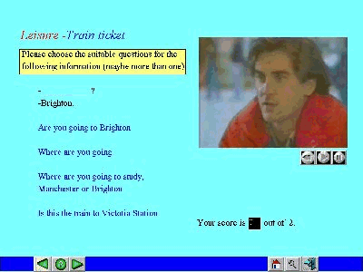
designed for it�s interactivity like the one
in Train tickets. The idea is that users have
some control over the materials the computer
is going to present to them. If they make a
different choice, the dialogue would go in a
different direction.
4.6
Text-based information
As
mentioned previously, the second purpose in
designing this package is to provide background
information about studying and living in Britain.
Generally speaking, this information, is text-based,
with hyper links, directing users to either
texts, pictures, audio recordings or video clips
describing and portraying the different aspects
within the four broad topics. Due to practical
constraints, I haven�t found a more satisfactory
way of displaying this long text of information.
I will come back to this in the next section.
5.
Conclusion
Having
finished the first design period of Pre-U. Experience,
I have two points to make here in the paper.
First of all, multimedia design is time-consuming
and labour-taking, and it should be a team project
rather than individual work. Due to the difference
in individual perceptions of the computer interface,
it may inevitably be personal taste or style
and might also be unbalanced if it is all done
by a single person regarding colours, text,
pictures and buttons and icons. Secondly, for
a CALL project like this, the first thing to
do is a clearly defined pedagogic aim plus a
clear navigation chart before the actual design
process begins. It saves time and energy. These
are only two points about multimedia design
in general.
There
are also some points about this particular piece
of software. As mentioned earlier, the Information
part about Study (in the U. K.) is not
very satisfactory. Due to its nature, it is
inevitably with long text. I tried to divide
the text into suitable sizes to put on each
page according to the sub-topics. In order to
avoid scrolling text box, there turned out to
be more pages. And also, this is aimed to give
some background information, the text itself
is not specially designed for language practice.
Only in the case of some difficult words or
special information like what a lecture sounds
like, there are some hyper links or pop-ups
to give an illustration or further explanation.
Another
thing is the activity in Train ticket where
users are given a choice between Manchester
and Cambridge to make their own dialogues. The
activity was designed for its interactiveness.
The present state of it is that when a user
finishes choosing a whole dialogue, the program
sticks there. If s/he wants to make a new series
of choices, s/he has to go to another page and
come back again. I was going to put a button
like NEXT DIALOGUE at the bottom to hide the
lines, but could not because it was only after
I finished all the dialogues that I realised
this problem and I could not remember which
text goes with which dialogue (all the text
boxes are hidden). For time�s sake, I could not
have gone over and done the whole page again.
It
will be a very interesting idea if I can carry
on the designing process when I go back to China.
Perhaps it will be more desirable and more helpful
if audio and video recordings of Chinese students
studying and living in Britain can be included
in the package. The easy identification with
the people in the software then would certainly
result in more active involvement, which in
turn would bring about more enhanced language
learning experience. Also, audio recordings
of sample lectures, seminars and tutorials will
be an important part of the background information.
As
an inexperienced CALL materials developer, this
amateur design process has been and surely will
be a valuable experience for me, a Chinese English
teacher who is always frustrated at trying to
find suitable language materials for his students.
Now that I know the strengths and weaknesses
of Mediator 4.0, I hope this superficial knowledge
will help me understand and learn to use other
authoring tools and bring me one step forward
into the vast field of multimedia design.
Reference
Brett,
Paul 1995. "Multimedia for Listening Comprehension:
The Design of a multimedia-Based Resource for
Developing Listening Skills", System.
Vol. 23, No. 1, p.77-85
Cortazzi,
M and Jin, L. 1996. "English Teaching
and Learning In China", Language Teaching.
No.29, p.61-80
Kristof,
Ray and Amy, Satran 1995. Interactive
by Design: Creating and Communicating with New
Media. Mountain View, California: Adobe
Press
O'Brien,
Myles 1997. "A Computer Program to Provide
Practice in Questions and Answers for Learners
of English", CALL. Vol. 10, No: 3, p.
299-305
Race,
Phil 1994. The Open Learning Handbook:
Promoting Quality in Designing and Delivering
Flexible Learning. London: Kogan Page Ltd
|